Interaction Data: The Key to Unlocking Customer and Member Delight

Today it feels like every financial publication is saying some version of “data analytics in banking matters.” But rarely do they explain precisely how institutions are supposed to track it, measure it, and use it to improve the customer or member experience. Nor do they pay attention to the interaction points that are still the lifeblood of most institutions: appointments and walk-ins.

We set out to change that in this practical, step-by-step guide. We share how to get a clearer picture of how customers and members interact with staff across online and offline channels in three stages. First, we cover how to gather your data. Second, we share how to set up banking analytics tracking and what metrics to measure. Third and finally, we’ll talk about using all that historical data to forecast things like traffic, staffing needs, and whether to make big decisions to redesign a branch.

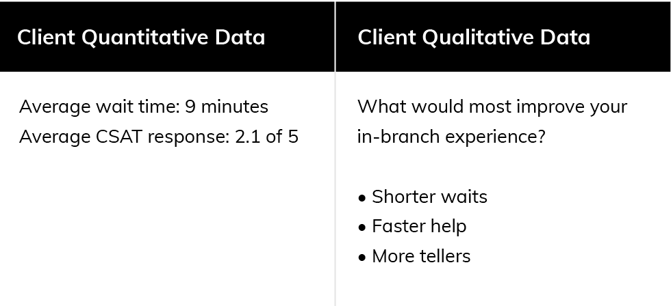
By the end, you’ll be making decisions with data and combining multiple data types to craft a better customer and member experience. For example, before, you may have known people waited an average of nine minutes in-branch. But did you know how they were feeling about the wait? What if to them, it feels short, and doesn’t need fixing?

When you have a data foundation as outlined in this guide, you’ll know the answer. And you’ll know answers to lots of other questions that tell your institution where your time is best spent improving customer and member engagement.

Phase 1: Build a Data Collection Foundation

Whenever you want to analyze something—be it shells on a beach or typical loan applicant backgrounds—you start by counting.

That’s where we’ll begin this guide—picking the data types you want to track to count things. For many banks and credit unions, the most valuable data still only exists in people’s heads, isn’t being collected, or there’s no formalized process for reviewing it. But until you start tracking a few metrics regularly, you can’t start answering questions or taking thoughtful, calculated actions to improve them.

In this first section, we look at three common data categories. Then we share seven places to find that data. And finally, we’ll guide you through building a spreadsheet to start tracking it.

You may be in this phase if one or more of these apply:

✅ Don’t yet know what questions to ask
✅ Are unsure what data is being collected
✅ Don’t have clear performance baselines
✅ Don’t have a formal process for reviewing data and acting on insights

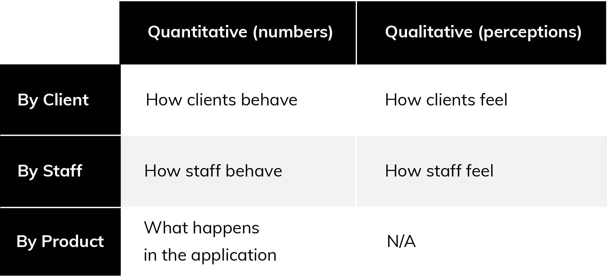
1. For the Full Story, Categorize Data by Clients, Staff, and Product

If you want to understand how clients interact with your institution, there are three sides to that story—the client’s take, the staff member’s take, and what happened in your client application or channel. Gather all three separately to understand how they influence one another.

Here are three ways to organize your data.

Analytics-Ebook-Phase1-Step1

Analytics-Ebook-Phase1-Step1-3

You can combine multiple data types to reveal insights. For instance, looking at both quantitative and qualitative client data would help you answer one of the questions we asked earlier: If you know your average wait is nine minutes, is that good or bad? With several data types, the story becomes clear (see right).


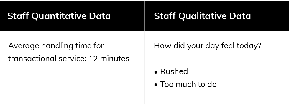
When you layer in staff data, the story takes on a new dimension. Let’s say average handling times are on the higher end for a transactional service—but your staff say they feel rushed. What is happening at that branch? That’s a data story to investigate (see right).

AnalyticsEbook-Phase1-Step1-3-2

2. To Really Understand Your Growth, Tag Data by Type

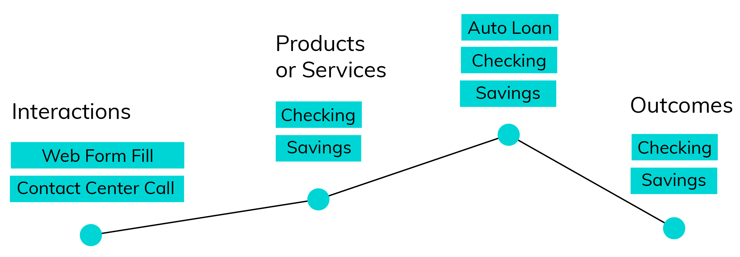
Consider this puzzle: How would you know if one loan officer has a higher close rate than another? Or if one advisor was far more effective than others at bundling products? Unless you track interactions, products, and transactions separately, you wouldn’t know.

  1. Interactions are any interaction between a client and your digital properties or staff. This includes things like phone calls, walk-ins, app logins, and more.
  2. Products and services are the things clients say they’re interested in, like loans, mortgages, checking accounts, financial health checks, wealth management, etc.
  3. Outcomes are the products clients actually end up buying.

These are the building blocks of understanding a customer or member’s journey.

Anayltics-Ebook-Client-Journey-2

Anayltics-Ebook-Phase-1-Step-2-1

And it’s only by tagging these three types that you’re able to answer questions like:

  • Did someone who interacted actually sign up?
  • Did they discuss multiple products, but only sign up for one?
  • Did an interaction with your staff get them to add more products?
  • How many interactions or touch points were required for a successful outcome?
  • Did a client decide not to move forward with a product?
  • Did a series of interactions end in a purchase?

Otherwise, if you only know the outcomes, you won’t know the journey that led there, and you’ll have a lot fewer data stories to tell.

Now, the next question is, where do you get real data, and start to do this for yourself? We cover that next.

3. Gather Your Data From Systems and Surveys

If you want to understand how clients interact with your institution, there are three sides to that story—the client’s take, the staff member’s take, and what happened in your client application or channel. Gather all three separately to understand how they influence one another.

Anayltics-Ebook-Phase-1-Step-3

7 Common (and Useful) Banking Analytics Data Sources

1. Appointment and Queuing Platform

An appointment and queue platform can tell you what services people requested, what location they booked at, whether they showed up, who they met, how long they waited, how often they rebooked, what the next steps were, and more.

  • Shows desired services, handle time, wait and lead times, no-show rate, source, completion, outcomes

2. Survey Results

Satisfaction surveys are one of the truest barometers you can get on clients’ thoughts and feelings. Consider the question we posed earlier: Did people think the nine-minute wait was long or short? Unless you ask, you never know.

  • Shows satisfaction, sentiment, needs, requests

3. Customer Relationship Management (CRM) Tool

If your staff logs their client interactions and opportunities in the CRM, it can tell you how conversations progressed, how long it took to close a product, whether the rep included additional products, and more.

  • Shows staff activities, opportunities, interactions, products

4. Marketing Tools (Email, Ads, etc.) 

If you send lots of emails, it can be valuable to know which get clicked, how often, and what sorts of things people tend to click. Similarly, ads can give you insight into what products or messages work.

  • Shows interactions, product interest, campaign performance

5. Contact Center

Where do your staff log customer service interactions? Those interactions are meaningful to understanding the full view of your customer or member and their experience, and what happened when they needed help.

  • Reveals service issues and resolutions

6. Website, Online Banking, and Mobile Apps

How do customers and members engage you digitally? Interaction data from your website, online banking portal, and mobile app can shed light on what services people are interested in, how useful they find these channels, and what offerings are underrated.

  • Shows interactions, desired services

7. Associates and Staff

Your staff hold a trove of insights on customers and members, as well as their own experience. Their observations, comments, engagement scores, and feedback can help paint a fuller picture of roadblocks and opportunities.

  • Shows staff sentiment, qualitative feedback

4. Organize Everything in a Simple Data Catalog

As you’ve been reading, have any questions stood out to you? If so, it’s a useful exercise to think through what types of data you’d need to answer those questions. Use that information to create what’s known as a data catalog (or schema) in a spreadsheet where you list out all the types of data you want to be tracking, the category, type, tags, and where the data comes from.

Then, go to those tools and survey systems, or ask staff, and figure out how your institution and each branch are doing on those measures.


For starters, you might want to record:

  • Walk-in traffic
  • Appointments
  • Capacity
  • Time with clients
  • Wait time
  • No-show rate
  • Staff sentiment
  • Most popular services

Analytics-Ebook-Phase1-Step4 -3

REAL-LIFE EXAMPLE

Rogue Credit Union Perfects its Appointment Length With Data

Rogue CU doesn’t leave the appointment experience up to chance. The team regularly reviews appointment data to understand whether meetings run over or under, and adjusts the default times accordingly. They also evaluate which services are most popular, and move those to the top of the dropdown menu.

“On the appointments page, we don’t want to offer a laundry list of all we offer,” says Edwin Rivera, Member Delivery Administrator. “We want members to be able to quickly select what they’re looking for.”

Members love Rogue CU’s ever-improving interaction experience. In 2021, they booked 20% more appointments with the credit union than the year prior.

If you’ve completed Phase 1 steps 1-4, congratulations:

You’ve built your institution a client interaction data foundation!

This will show you how things are going today, and establish baseline measurements against which you can compare future performance. If you know your baselines, you can watch whether small changes impact the client experience, and start to run tests.

To progress to Phase 2:

✅ Build a basic data catalog
✅ Establish baselines for your top metrics or key performance indicators (KPIs)
✅ Initiate a discussion about making decisions with more data
✅ Begin a list of questions you’d like answers to

Phase 2. Set Up Banking Analytics to Measure Continuously

The key difference between just data and data in an analytics dashboard is that while spreadsheets present the facts, analytics simplify things and do some of the analysis. Dashboards help you visualize data with progress bars, odometers, and charts. It frees you from having to constantly calculate, and lets you ask better questions.

Having data in a spreadsheet is a great first step. But for that data to be really accessible and useful, you’ll want to move it to an analytics dashboard, and that’s what we cover in this section.

You may be in this phase if one or more of these apply:

✅ You know what data is important to your institution
✅ You have a few data points you’re tracking regularly
✅ You have an analytics dashboard—possibly more than one
✅ There’s a formal process for acting on data insights

1. Select (or Build) Your Analytics Dashboard

Where will you get your own analytics dashboard? Well, that’s the tricky thing. A spreadsheet can tide you over in the meantime. You can write formulas to do the calculating for you.

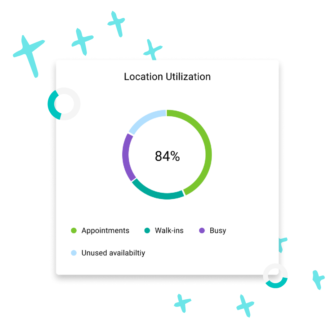
But long term, you’ll find it much easier to use software tools like your appointment and queuing platform, which provide ready-made analytics. Unlike a spreadsheet, that data will be constantly updated. And, if you sync the platform with your CRM, marketing, or business intelligence (BI) tools, you can get a more complete picture of the customer or member journey from one central system—all of which makes it easier to focus on asking great questions. Plus, you can always download the data and organize it yourself in a spreadsheet if needed.
Local Utilization 1

2. Make a List of Your CX Interaction Goals

Now that you’re getting more organized, it’s time to pause and ask, what do you hope to achieve by tracking things? And what actions will you take if the number is positive or negative? Ultimately, every metric you select should exist because it helps answer a question you already have. (Otherwise, it may just be a vanity metric.) And every test aimed at answering that question should be tied to a clear goal. Select 1-2 of the goals below that you want to focus on.

Some potential goals to focus on are:

  • Increase membership
  • Increase client satisfaction
  • Increase loans
  • Increase appointment volume
  • Better plan staffing
  • Better plan product launches and rollbacks
  • Better plan branch openings
  • Improve retention
  • Improve customer lifetime value

3. Make an Updated List of Questions You’d Like to Answer

If you’ve already been writing down questions you’re curious about, now’s the time to formalize that list. Good CX insights start with asking good questions.

Here are a few to get you started: 

  • Do our interactions tend to be single product or multi-product?
  • How many appointments does it take to obtain a loan?
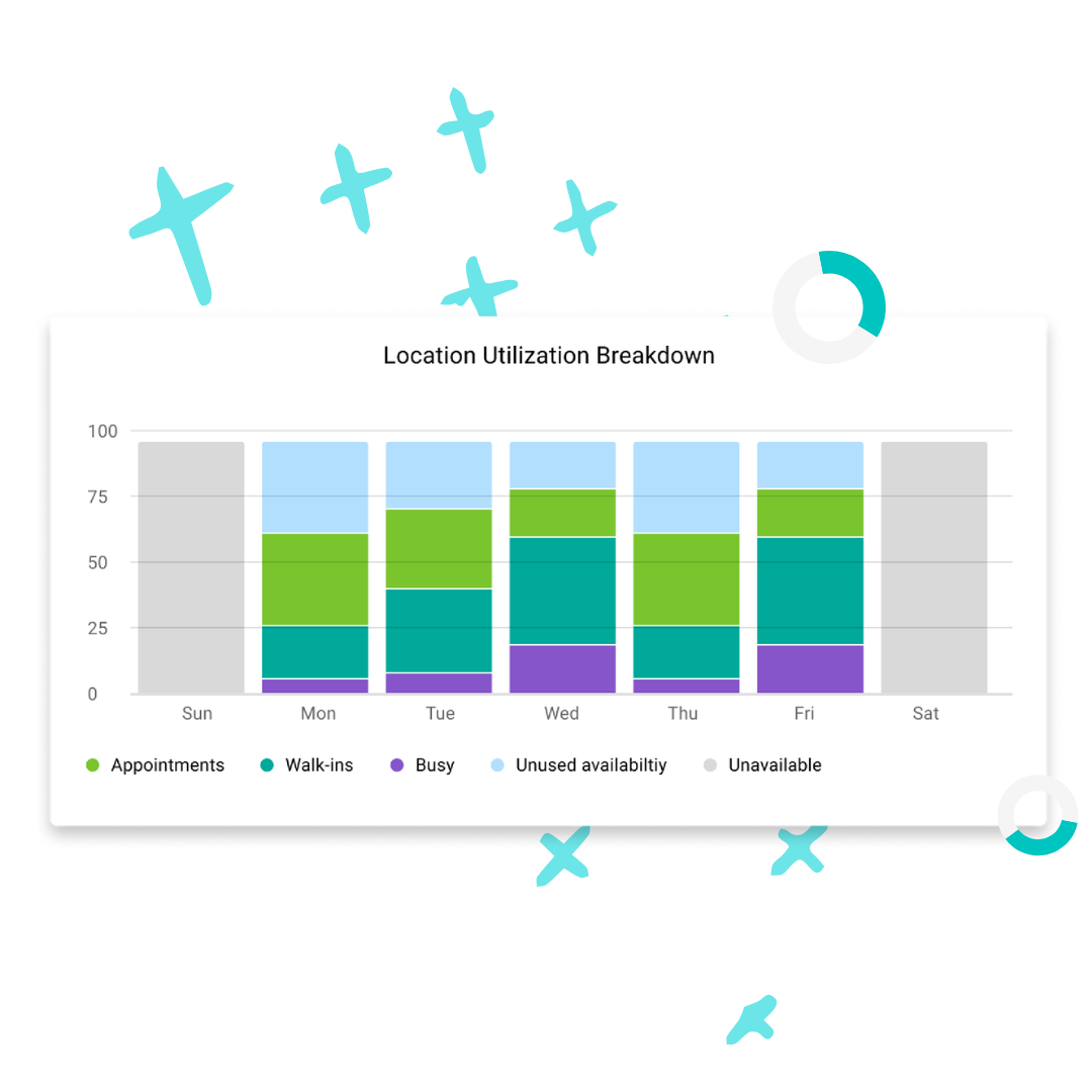
  • How fully are staff being utilized? What capacity do branches have to handle walk-in traffic or rebooked appointments?
  • Are staff spending time on the right things?
  • What interactions tend to lead to sales?
  • What interactions leave clients feeling satisfied?
  • What experiences cause members to churn?
  • Can we assign a dollar value to appointments?
Local Utilization 2

4. Select the CX Metrics You Plan to Track in Analytics

Now it’s time to select your metrics. Take your top 4-5 questions and work backwards to find metrics where, if you had those numbers, you’d have a pretty good answer to your question. For example, if you want to know whether your interactions tend to be single product or multi-product, you’d need to know:

  • The total number of interactions (in-person or online)
  • The total number of products attached to interactions
  • And ideally, which products are tied to which interactions

Using your questions, select data types or metrics from the list below, add them to your data map spreadsheet, and add a star next to them.

List of CX Interaction Metrics Financial Institutions Can Track

Client Metrics

  • Total interactions online
  • Total interactions with staff
  • Show-up rate—of people who booked appointments, how many showed up
  • No-show rate—the opposite of show-up rate
  • Missed appointments
  • Customer satisfaction—by average, by client, or by location
  • Most engaged—clients with the most completed appointments
  • Summary by client or household—all products by client or household
  • Client activity overview—see all of a client’s interactions with staff (calls, chats, or appointments), or digital campaigns or channels, or their in-progress or completed services
  • Top acquisition channels—how did people find you / where did they book from
  • Customer lifetime value—the average revenue an institution expects to make from a typical customer or member over their lifetime as a client

Product Metrics

  • Total products
  • Most popular services
  • Average products per transaction
  • Average products per interaction
  • Average interactions per product/service type
  • Top channels—how did people find you / where did they book from

Staff Metrics

  • Total interactions with clients
  • Appointments per location
  • Appointments per staff
  • Lead time for booking—how far in advance people book appointments
  • Walk-in volume—total in-branch walk-in traffic
  • Wait times
  • Handle time—how long it takes an advisor to help a client
  • Abandonment time—how long before clients abandon queue
  • Busiest and slowest branch times
  • Waitlist trends—whether wait times are growing or shrinking
  • Staff interactions—number of interactions for individual staff over time
  • Staff utilization—pool of available staff time
  • Staff capacity—how much time staff have open for future appointments
  • Location deep dive—traffic map by location, by hours/day
  • Location traffic trends

5. Use Your Analytics to Run Experiments

We’ve covered a lot, so let’s put it all together. To use your analytics, you take a goal, ask a question around that goal, and select metrics to answer your questions. If you input that data into your dashboard (be that a spreadsheet or software tool), you can now start making changes to your customer experience to test whether those changes have the desired effect.

If your goal was to increase loans, and you found your products per interaction seemed low—just 1.2 financial products, say—you could run a promotion to encourage staff to add more products. You could offer an added bonus for referring loans to the loan officer for the next three months. At the end of that time, you can refer back to your analytics. Did that change increase your products per interaction to the desired 1.4? If not, keep trying things.

The analytics keep you focused on whether your actions influence your metrics, which tells you what works and what doesn’t.

There are an unlimited number of experiments you can run, and highly rated institutions are constantly running tests like these. “Understanding how our members prefer to engage by channel influences how we operate our branch network every day,” says Martin Harris, Senior Manager of Retail Delivery at Kawartha Credit Union. “We review how meeting methods differ by location, by appointment type, and by time of day to be sure we understand.”

Your experiments can loosely follow the scientific method:

  • Ask a question
  • Take a baseline measurement
  • Record a hypothesis
  • Make a CX change for a set period of time
  • Review the data
  • Record the results

Reviewing staff performance? Keep it positive.

Always approach staff productivity from a place of curiosity and learning. It’s not, “Why is this staff member underperforming?” It’s, “What are they spending their time on, and could their skills be better used elsewhere? Are they spending time opening accounts when they could be working on loans?” The goal is to help them do their jobs better, never to punish.

REAL-LIFE EXAMPLE

Kawartha Credit Union Achieves a 98% Appointment Show-Up Rate Through Experimentation

The team at Kawartha CU was curious how they could increase their client satisfaction, and ran tests measuring member satisfaction frequently. They discovered that when people booked an appointment, their satisfaction was higher than people who didn’t. And for members who received an email or text appointment reminder, it was even higher.

“The anecdotal feedback from membership supported our conclusions,” says Martin Harris. “The booking method was increasing people’s satisfaction because it was so convenient. We’ve booked over 140,000 appointments over the past two years, and 98% of people showed up for them.”

If you’ve completed Phase 2 steps 1-5, congratulations:

You should have a question, metrics that suggest an answer, and a way to track them.

You should also have run (or begun) an experiment that should influence that metric. Whether or not it was successful, hopefully you recorded that knowledge and tried something else. And now, if you’re ready to take it further, you can start thinking about how to forecast branch traffic and future staffing needs.

To progress to Phase 3:

✅ Gather enough data over time that you can begin analyzing trends
✅ Begin gathering questions about the future

Phase 3. Start Making Forecasts

Forecasting is, simply, using past data to anticipate the future. It’s asking, “How did things go last time?” and extrapolating that into the future. And while imperfect, forecasts can help improve your staffing and planning decisions beyond mere guesswork.

Knowing how many people showed up last month is valuable. But knowing how many will show up next month is the real prize—and that’s what this section is about.

You may be in this phase if one or more of these apply:

✅ You have enough historical data to make educated guesses about the future
✅ Forecasts would help you plan, staff, and improve the client experience
✅ You’re able to set clear targets and track progress toward them
✅ You have the internal resources to act on your findings

1. Pick an Area to Start Making Predictions

You can create a forecast from any quantitative metric that you have past data on. For example, but not limited to, staffing levels, product popularity (like loan growth), member growth, hiring needs, and branch expansion, to name a few.

That in turn can help you answer questions about events in the future:

  • Will we need to pull in floating staff?
  • Will we reach higher staff utilization levels?
  • Can we predict our no-show rate and account for that?
  • What will traffic be like next week, month, or quarter?
  • Will better training increase staff utilization?
  • Will hiring actually increase capacity?
  • Should we discontinue a service plan?
  • Should we open a virtual branch?
  • What’s the next best action for whoever’s handling walk-ins?

2. Gather Your Historical Data

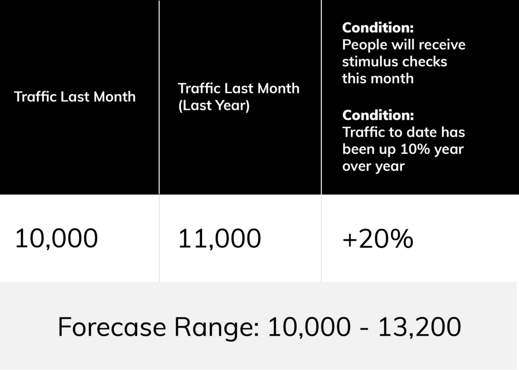
A forecast simply asks, “How did things go last time?” Or, “Where are things trending?” You’ll need two things to make a forecast:

  1. Historical data for this same time period in the month or year prior
  2. A list of conditions that might influence that data

Why look at the same time period in the prior year? Because the time of month or year matters a lot. You could compare call volume on April 15 to March 15, but if you know the former date is U.S. Tax Day, it’ll be far more accurate to compare April 15 to the same day last year.

Your list of assumptions could include all sorts of anomalies, like the fact that your data over the past few years is probably skewed by the pandemic. Calls and video calls may have been high because branches were closed. You have to control for those factors, which may mean increasing or decreasing the forecast based on an estimated percentage. (There is always a degree of guesswork involved. The data you’ve collected helps you make educated guesses.)

Here’s what that might look like:

Analytics-Ebook-Phase-3-Step-2-1

3. Experiment to Verify Your Forecast Accuracy

If you want your forecasts to grow more accurate with time, record your hypotheses and how things actually went. Did you forecast 30% higher walk-in traffic for September, but it was actually 50% higher? Record that surprise in a log where you’ll look at it next time. Even surprises can, over time, reveal trends.

This should help you build knowledge such that you can assign specific weights to different factors, and even give a confidence score along with your forecast.

4. Let Software Do the Forecasting for You

If you’re using analytics within tools like appointment and queuing, very likely, their interfaces will do some of that forecasting for you. This requires a lot less maintenance, and it can automatically calculate confidence intervals and overlay time series for you.

If you do rely on vendors’ analytics dashboards, just be sure you understand their assumptions behind the data. The more you know, the more you can adjust your forecasts. And, the more you can understand why numbers might differ between systems. For instance, when a tool says “appointments per month,” is that per calendar days or business days? If it’s dividing the total appointments by 21 days rather than 31, that’s a very different result.

Analytics Coconut

REAL-LIFE EXAMPLE

Kawartha CU’s Traffic Forecasts Led to Branch and Staffing Changes

Kawartha’s team noticed that at one of their branches, wealth management appointments were much higher than at other locations. “After reviewing the data, and understanding the advice our members are seeking, this resulted in the hiring of more Wealth Management staff at that location to meet the advisory demand of the members,” says Martin.

With transaction based engagements on the decline and advisory engagements (like membership openings, consumer lending, and wealth management) increasing, the team also decided to transition one of their traditional branches from a cash services focus to an advisory model. Then, it would support members’ transactional needs through ATMs, and online and or mobile banking.


If you’ve completed Phase 3 steps 1-4, congratulations:

You’re forecasting with data.

It’s not so complex after all, is it? The real learning comes when you verify your forecasts and get some answers. Did the forecast help you plan? If not, what can you learn for next time?

This is just the beginning of what you can do with forecasting. If you have a data science team or resources, you can go beyond standard forecasting (which is based on historical averages) to more advanced, predictive models. These advanced algorithms layer a number of data points (which can include previous metrics, public data sets, or industry trends) to automate forecasting and greatly increase its accuracy.


To continue to improve:

✅ Share forecasts widely and solicit input
✅ Make data available to core teams
✅ Make data accessible and easy to understand to non-expert team members
✅ Consider investing in more advanced business intelligence (BI) tools
✅ Consider investing in data science roles or resources

Telling Better Data Stories Leads to Better Experiences

Data helps you tell stories.  All your data stories should lead you to insights. Those deep insights will inform your actions to improve the customer or member experience. The end result is data-driven improvements that make customers and members feel taken care of.

Take a page from this book by building a data foundation, launching analytics, and experimenting with forecasting. And then ask, where will your own data story lead?

See More of Your Customers’ or Members’ Journey With Coconut Software

✅ Built for banks and credit unions
✅ Seamless customer and member experience
✅ Launchable within weeks or months
✅ Industry-leading privacy and security standards
✅ Continuous innovation and improvements
✅ Unmatched support and strategic guidance

Speak to An Expert